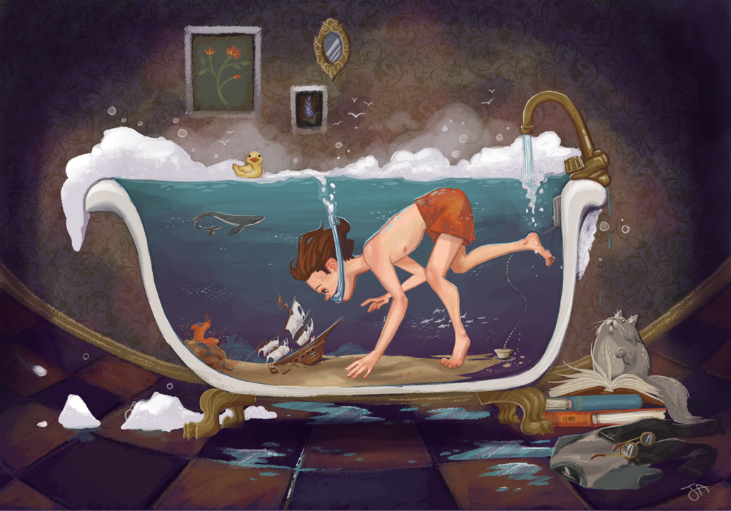
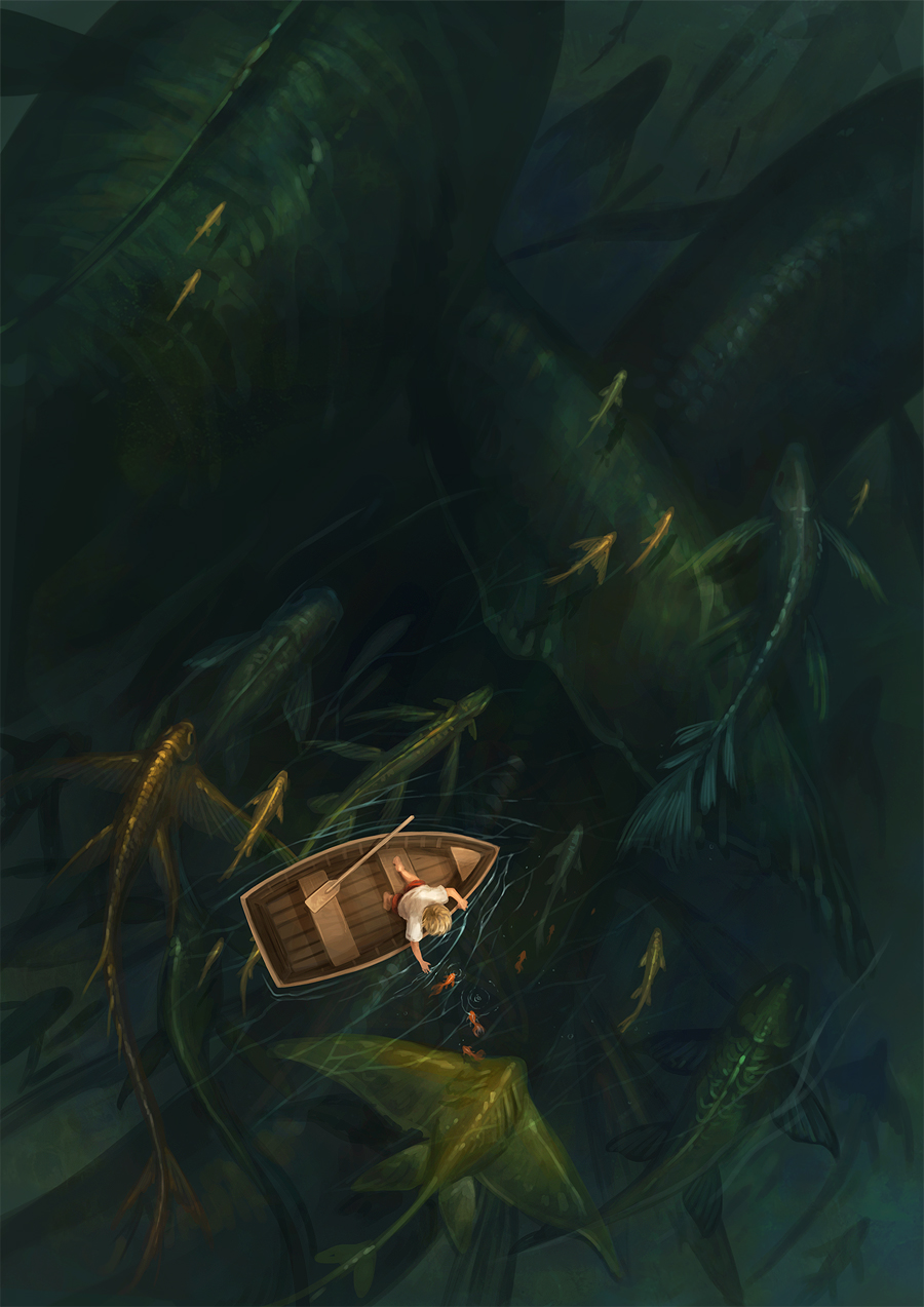
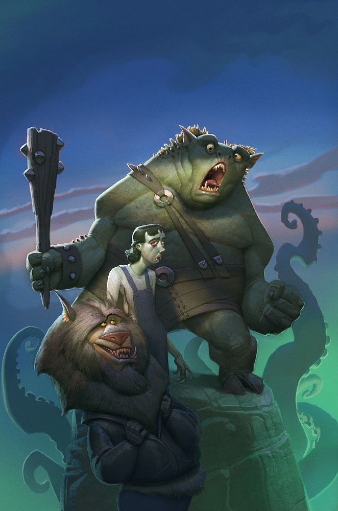
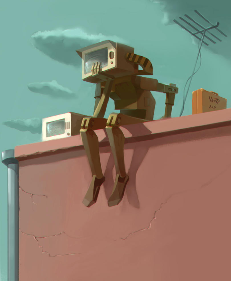
NoBrow is a fantastic publishing outlet for creative and independent illustrators looking to showcase their work to like minded illustrators and enthusiasts in the UK. The books they publish are a great way for the illustrators to advertise themselves to scouts looking for talented illustrators, with the book incorporating the contact details of each individual artist.In this, NoBrow is typical of the collaborative independant art movement, playing a key role in bringing artists from around the world and do it in a style that that feels geniune and doesnt exploit the artists, but rather celebrates the wprk of artists who deserve the recognition.
NoBrow Artists:
Stuart Kolakovic
Stuart Kolakovic is an artist found featured in NoBrow. What particularly excites me about his artwork is his sensitive use of colour pallete, which tends to be apparent in all of his work. His work has got me thinking about how i could use colour pallete to add mood and make my work look attractive to potential buyers but also how it can add a sense of proffessional sensitivity and concsistency to a piece or set of artworks.
The style stuart works in is one typical of the independant illustration field. I want to say cliche, as it looks and feels similar to all the kind of work that is popular in indy illustration at the moment. There is nothing that really sets this illustrators work apart from the rest and is something i am particularly sensetive to when i produce my own work.
Tom Rowe
Tom Rowe is another illustrator I discovered through NoBrow. Is style has got me thinking about how I could work when producing my illustrations. He creates 3d form even in the simplicity of his vectorised designs, which I think I could experiment with as a way of streamlining and adapting to produce imagery in a way that suits me, as form and light is something very important to my image making process. Rowe's bold use of colour is one that seems to go against the stream in the current illustration, yet works surprisingly well at adding a retro style to his art.
Jack Teagle
Jack Teagle's work is produced in a style that covers alot of ground, while his subject matter caters to a wide audience. Teagle's use of colour and repeating imagery of known pop icons has similarites to the pop art movement, and makes me consider the influences of my own work and how i might incorporate them into illustrated prints whilst adhering to my own style. Artwork like this seems to really commercialise the independant aspects of his style, using characters that are known on a worldwide scale. I think that this also increases the likelihood of interest and people looking to buy something that adheres to their interest in a pop culture but are looking for something to decorate their room or buy for a friend.
My Independant Practice - What inspires My Personal style?
To create artwork of my own, I need to reflect on the themes that inspire me and the techniques in which i can use to express these. |
 |
 |
 |
 |


No comments:
Post a Comment