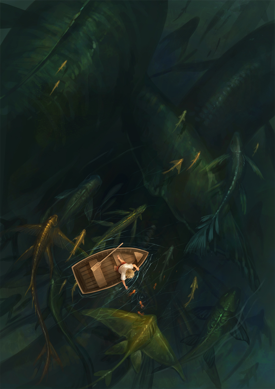
Monday 4 March 2013

Illustrated Packaging

Samara Andrews

Illustrated packaging is a great way of giving products an added sense of value. For example these packets illustrated by Samara Andrews with texture and healthy colour pallettes, give a home grown 'Touch of Love' feel to the product. This attention to packaging in turn makes the product seem like its worth more and better for you.

Burnt Sugar Packaging - D.Studio

''We then commissioned five illustrators to ‘doodle’ all over the packs so each product had its own individual personality. Not a single font was used on any of the packs – every element was meticulously hand-rendered, including the back of pack statutory information, right down to the recycle logo and ‘e’ sign.''
(Source: http://lovelypackage.com/burnt-sugar/)

These hand illustrated packaging designs allow for a product to gain its own identity and stand out from the sea of items all crying out for your attention. As with the crisp packet designs above, these illustrated bags give a product more valuable and are far more attractive products for people not just looking for a tasty snack, but also looking for some interesting gift fodder. I find this product particularly interesting as even though each product is a different colour with different illustrations, the set feels cohesive and considered. You almost want to buy all the different editions just to have them all.

Andrew Bannecker


These Illustrated drinks bottles are good examples of all the benefits of illustrated packaging, except with this set being in a foreign language, it becomes easier to analyse the imagery in its communication of the product. I find that while visually the designs look very pretty, as someone relying on the imagery, I cannot understand what the illustrations mean, or even what drink is inside. It is safe to say tha each adheres to a different flavour but the illustrations do not communicate as clearly. Looking back at the other packaging I have been researching i realise that this is a common flaw in the illustrated packaging niche. Perhaps this kind of branding only works on a small, indy scale, rather than worldwide corporate design. It does seem that illustrated packaging calls out to consumers who are looking for something more than just what is inside.

Leap Organic Soap - Colorado Studio Moxie Sozo


These beautiful hand illustrated designs on Leap Organics Soap give the product a truly unique and individual style. A sense of authenticity is given to the product which makes it very attractive for potential consumers. I feel the illustrations work better on the box packaging than the soap bottles. I think this is due to the tactile nature of a box as opposed to the plastic, throwaway feel that comes with man made materials. I feel that hand illustrated packaging says 'Sustainability' and 'Eco freindly' which has a rather jarring effect on the plastic bottles.

Friday 1 March 2013

Dans Le Vide


I found this artist on DeviantArt. His work got me thinking how i could use digital software to create imagery that is less render heavy but still pwerful illustration. His one off pieces work well as single illusrations that could sell as limited edition prints and also have a handmade aesthetic despite being digital. I'd like to experiment in photoshop to see if i could create imagery in a similar style: Using more reserved purposeful brushstrokes. The painted edge border design on the 'Hoffnung' piece gives the art a 'one off' feel that would look good in print on high quality paper.


Tom Frost


As the intitial inspiration for this project, Tom frosts work is good for seeing the context that everyday objects can be put into to create indy style limited edition artwork. Toms use of the everyday and colour pallette give his work a warm feeling that invokes nostalgia and authenticity. The combination of old fashioned subject matter with fairly contemporary illustration techniques creates work that function as attractive decor, feeling new and old simultaneously.


No Brow Press and Artists


NoBrow is a fantastic publishing outlet for creative and independent illustrators looking to showcase their work to like minded illustrators and enthusiasts in the UK. The books they publish are a great way for the illustrators to advertise themselves to scouts looking for talented illustrators, with the book incorporating the contact details of each individual artist.In this, NoBrow is typical of the collaborative independant art movement, playing a key role in bringing artists from around the world and do it in a style that that feels geniune and doesnt exploit the artists, but rather celebrates the wprk of artists who deserve the recognition.

NoBrow Artists:

Stuart Kolakovic


Stuart Kolakovic is an artist found featured in NoBrow. What particularly excites me about his artwork is his sensitive use of colour pallete, which tends to be apparent in all of his work. His work has got me thinking about how i could use colour pallete to add mood and make my work look attractive to potential buyers but also how it can add a sense of proffessional sensitivity and concsistency to a piece or set of artworks.

The style stuart works in is one typical of the independant illustration field. I want to say cliche, as it looks and feels similar to all the kind of work that is popular in indy illustration at the moment. There is nothing that really sets this illustrators work apart from the rest and is something i am particularly sensetive to when i produce my own work.

Tom Rowe


Tom Rowe is another illustrator I discovered through NoBrow. Is style has got me thinking about how I could work when producing my illustrations. He creates 3d form even in the simplicity of his vectorised designs, which I think I could experiment with as a way of streamlining and adapting to produce imagery in a way that suits me, as form and light is something very important to my image making process. Rowe's bold use of colour is one that seems to go against the stream in the current illustration, yet works surprisingly well at adding a retro style to his art.

Jack Teagle


Jack Teagle's work is produced in a style that covers alot of ground, while his subject matter caters to a wide audience. Teagle's use of colour and repeating imagery of known pop icons has similarites to the pop art movement, and makes me consider the influences of my own work and how i might incorporate them into illustrated prints whilst adhering to my own style. Artwork like this seems to really commercialise the independant aspects of his style, using characters that are known on a worldwide scale. I think that this also increases the likelihood of interest and people looking to buy something that adheres to their interest in a pop culture but are looking for something to decorate their room or buy for a friend.

My Independant Practice - What inspires My Personal style?

To create artwork of my own, I need to reflect on the themes that inspire me and the techniques in which i can use to express these.

 This kind of powerfully conceptual image is the kind of work that really inspires me. The use of digital media allows the piece to be rendered in a style that i can relate to in my own practice.